Case Study- Branchless Bank
Overview
The objective of this project was to create an app for a fictional bank that was completely digital, meaning it has no physical locations. We saw this as a project that has real world merit and thus, took it upon ourselves to design and prototype an app that put these principles in to action.
Context and Challenge
This project was proposed by our instructor Lexi during week 2 of the UI design cohort at the Iron Yard’s Raleigh campus. We had a weekend to complete our mockups and upload them to invision. After that we had to present them to the staff and other students from previous cohorts while gaining feedback from our presentations. The overarching purpose of this project was to get us familiar with prototyping while allowing us to practice our presentation skills. The problem of this project was that a fictional bank (branchless bank), needed an app that made it easy to use their services. The goals of this project was to create a simple yet attractive app that allows the user to utilize all the tools of a physical bank without actually walking in to a bank. It was important to make it super accessible so a wide variety of people could this app without any complications.
The Process and Insight
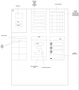
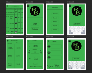
This project started out with a brainstorming session where we basically came up with ideas for a layout for our app. This included things like menu items, login screen details, logo ideas, and just overall “feel” to the app. After I had all the details sorted out, I began doing rough sketches of the different screens this app would contain. We went over these as a group and gave feedback to each other on what we thought worked and didn’t work. Once we gathered the appropriate amount of feedback, we started creating our wireframes in Illustrator. After gaining more feedback, we moved on to the next step which was mocking up our app in Photoshop which you can see below.


Solution
Our final part of the project was to present our work in a professional and concise manner to our mentors and peers. We walked through each screen of our app and explained the functionality in detail to the folks watching. I decided early I wanted a vibrant and clean looking app that was super clear what you could and could not do. I didn’t want there to be any discrepancies on what was possible with this app. I created a black logo that I thought contrasted nicely with the vibrant green background. I was inspired by logos of tv shows, particularly Breaking Bad, and Daredevil. My designs improved over the duration of the course which you can see with my other projects but I believe this was a good first step in the right direction.
The Results